
The challenge
Create one coherent brand environment across a multi-zone Rider Center while keeping every space practical, easy to navigate and relevant to the people using it every day.
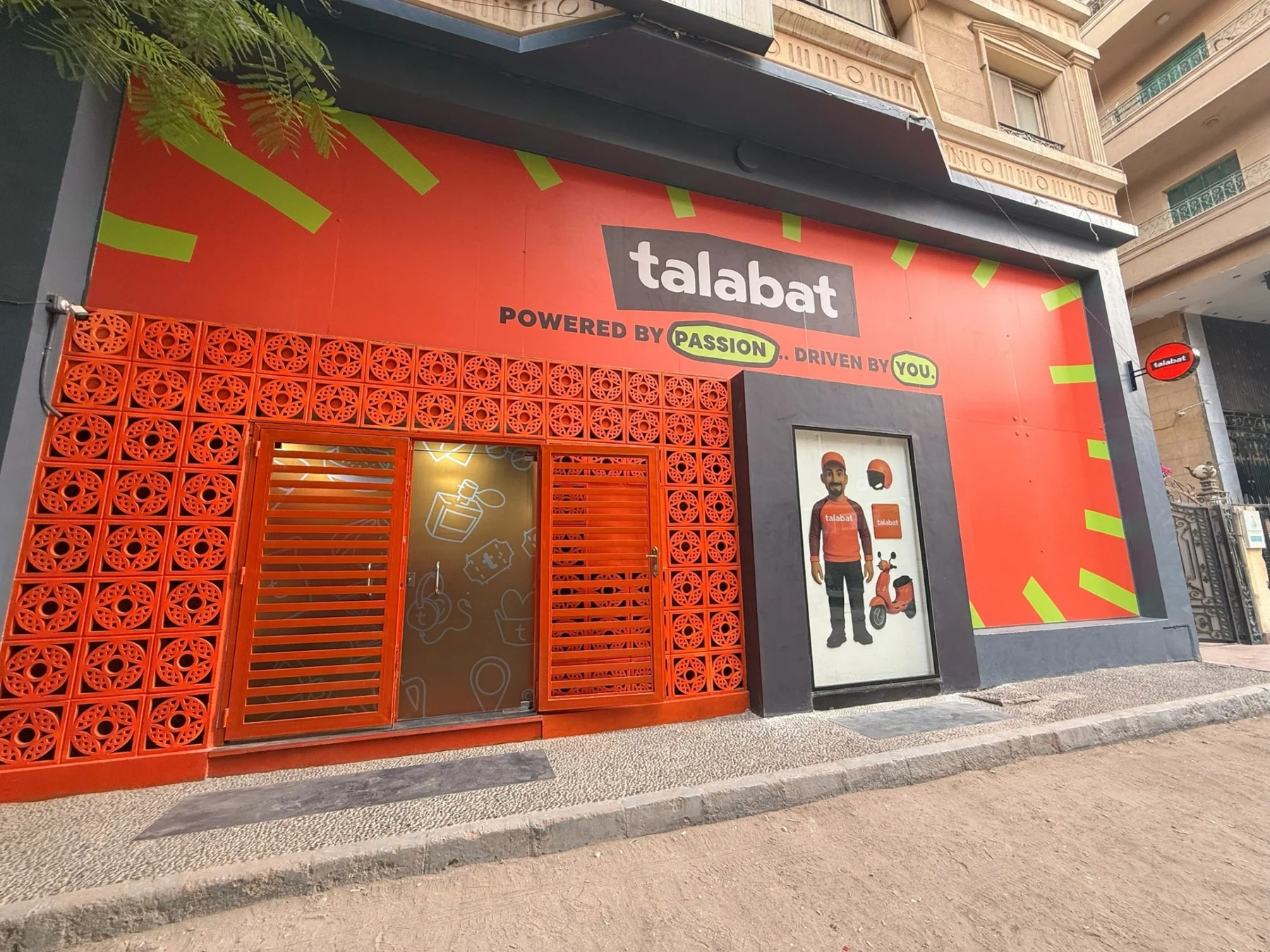
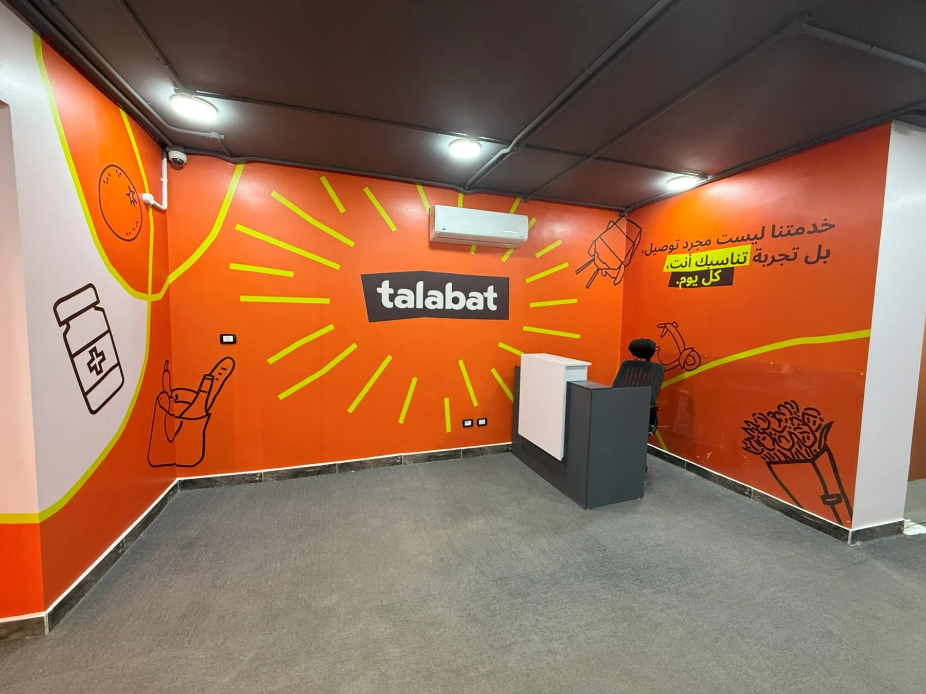
The system needed to work from the street-facing facade to reception, corridors, offices, training classrooms, meeting rooms and shared areas without becoming repetitive.
Our approach
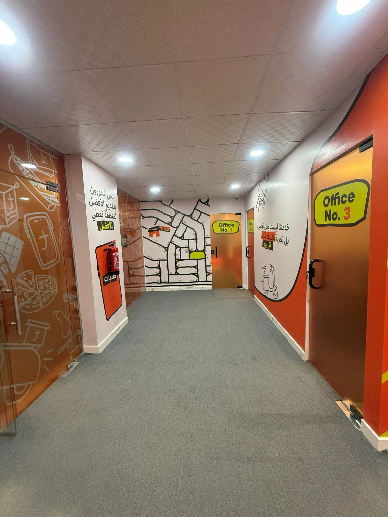
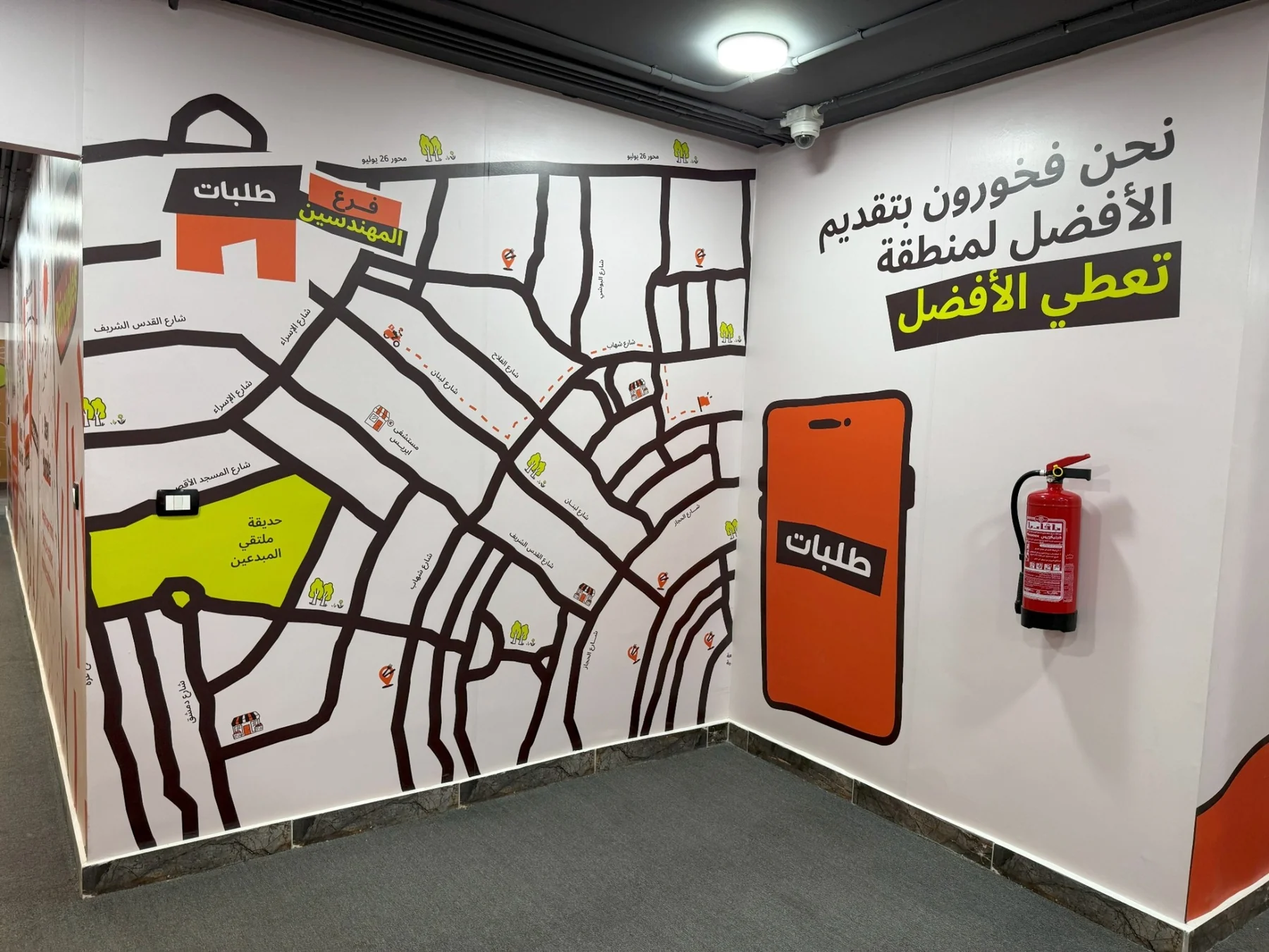
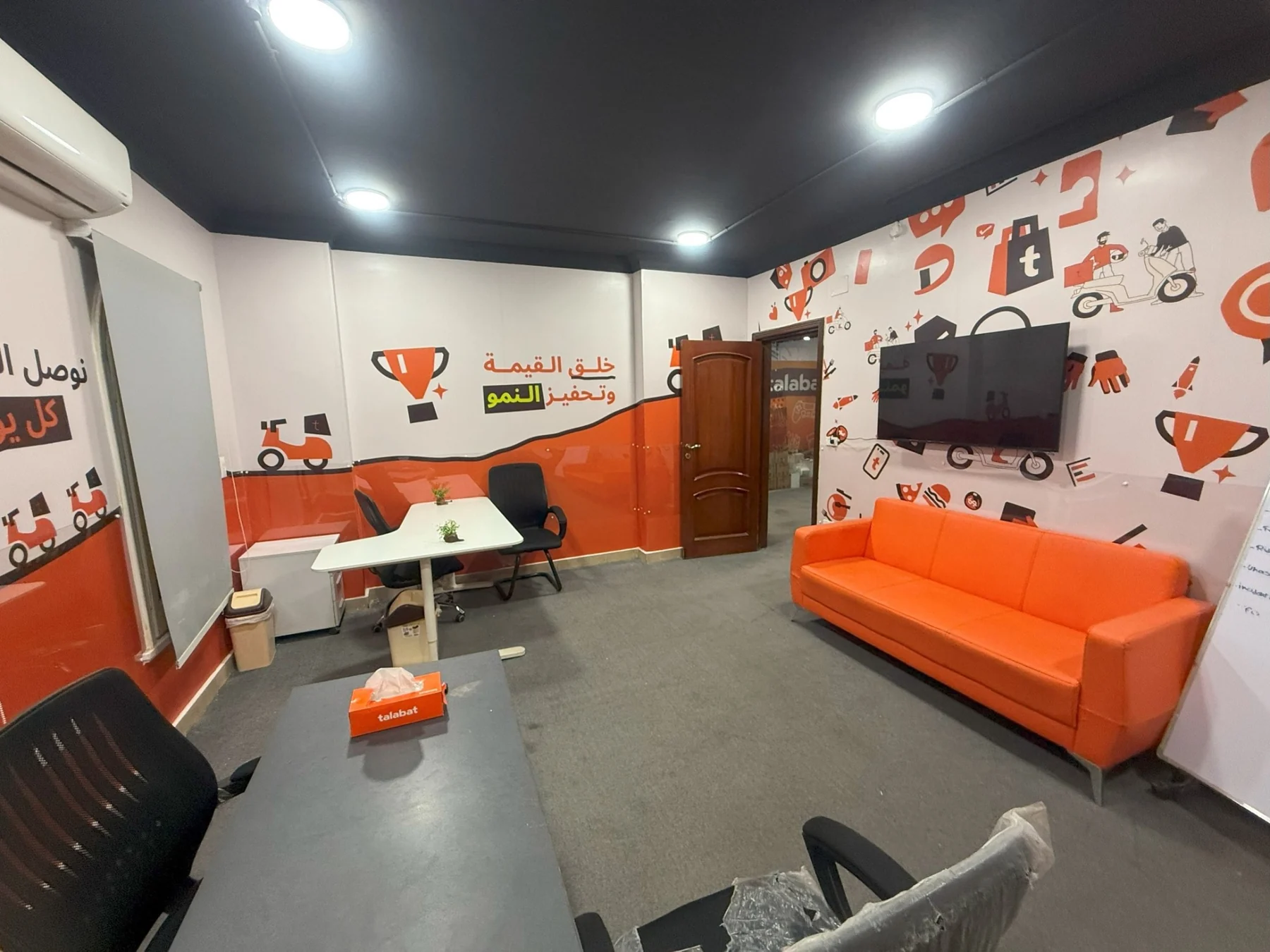
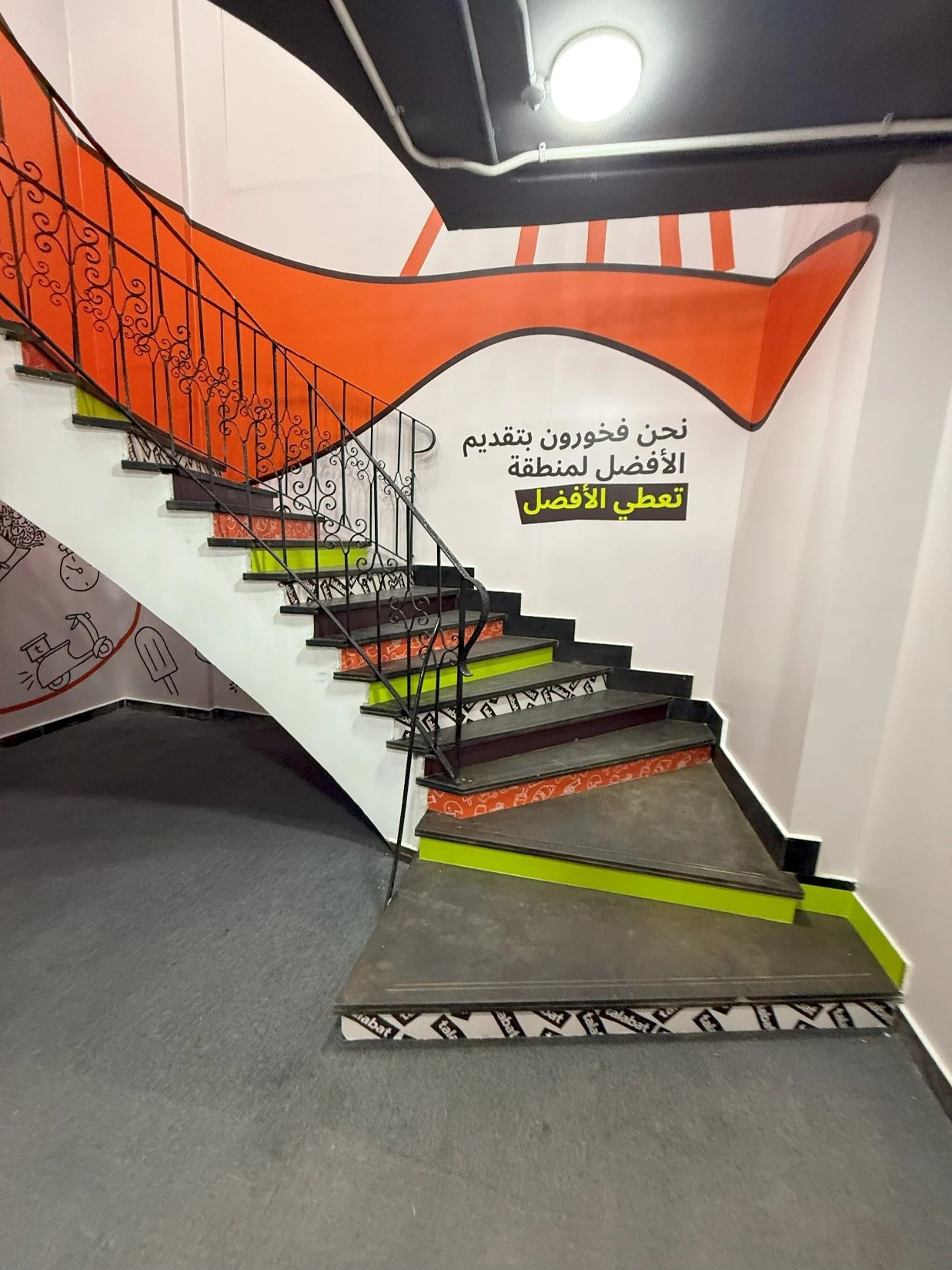
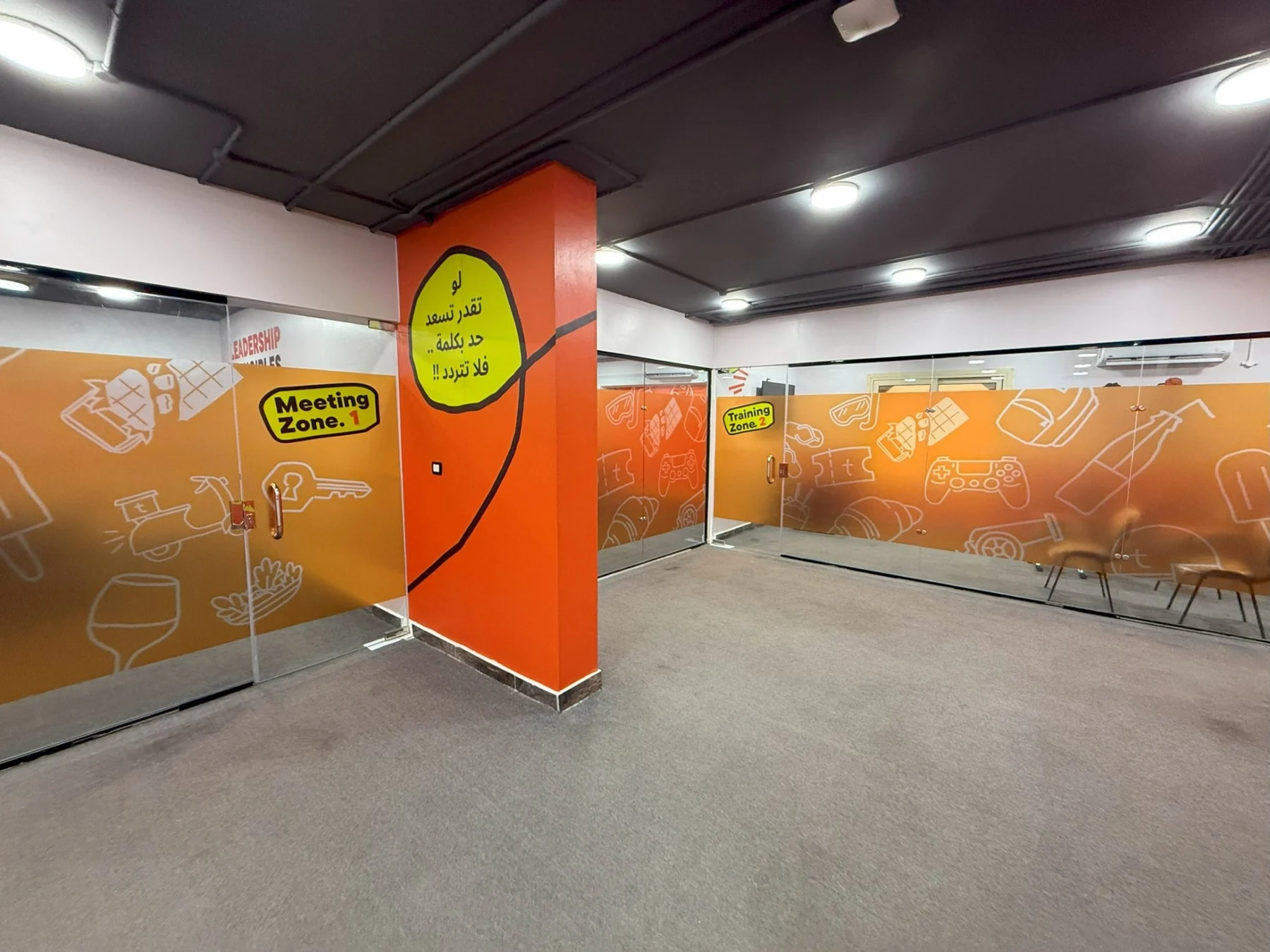
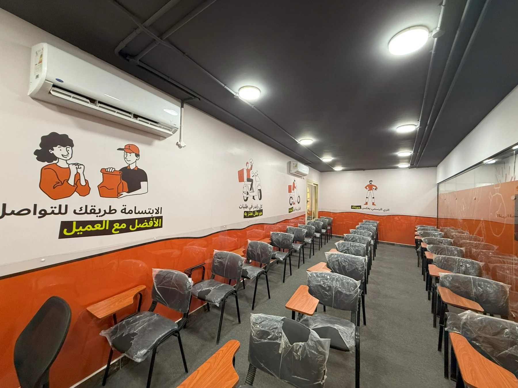
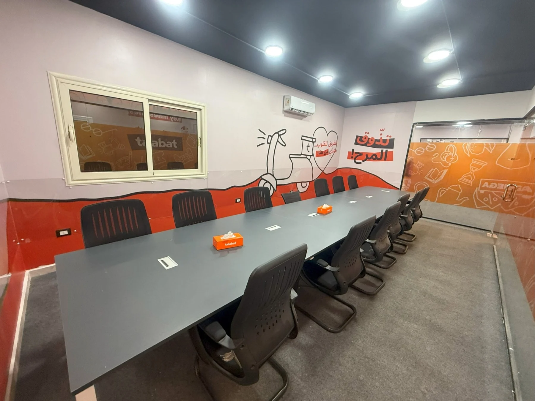
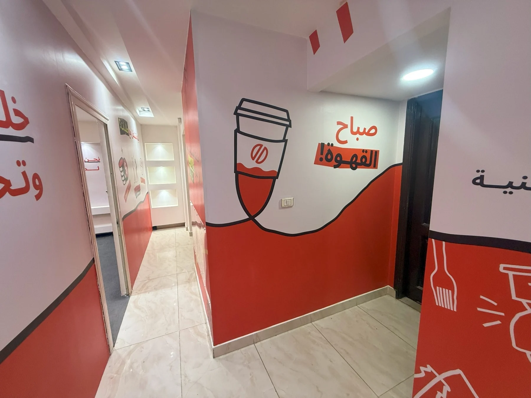
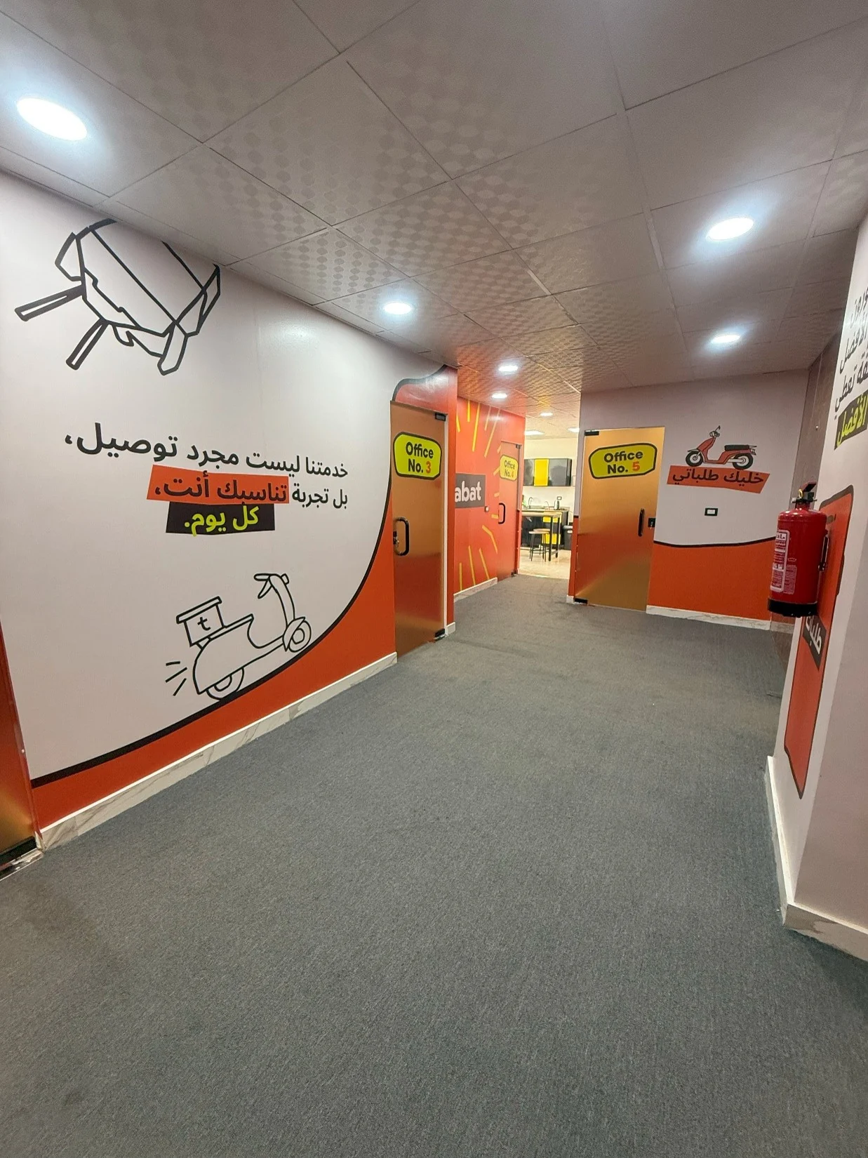
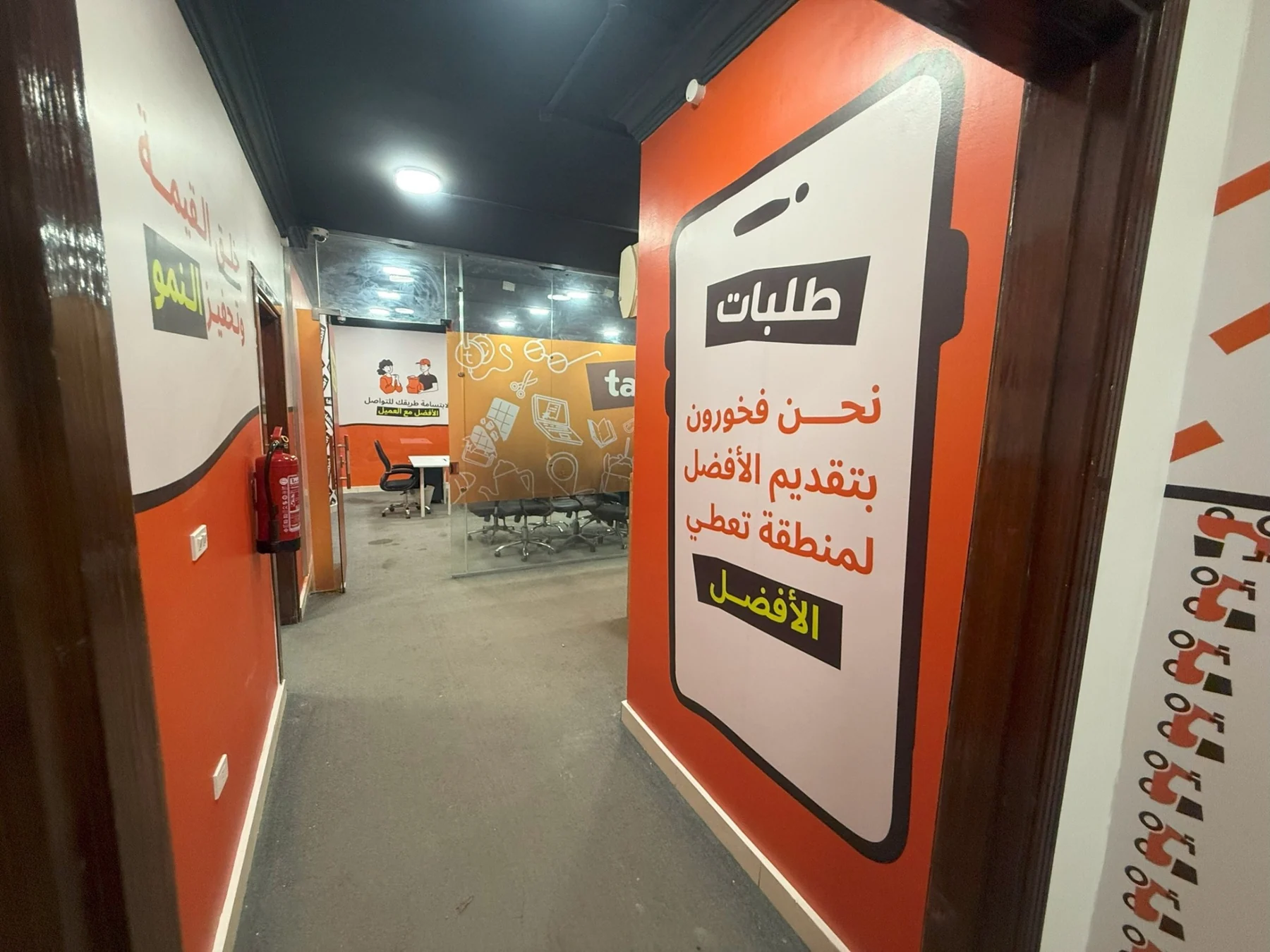
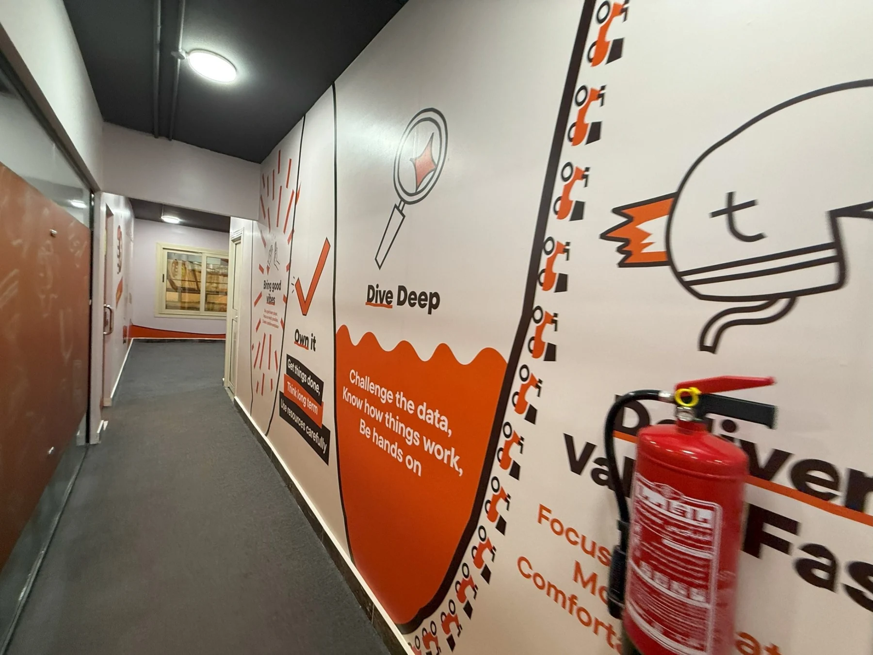
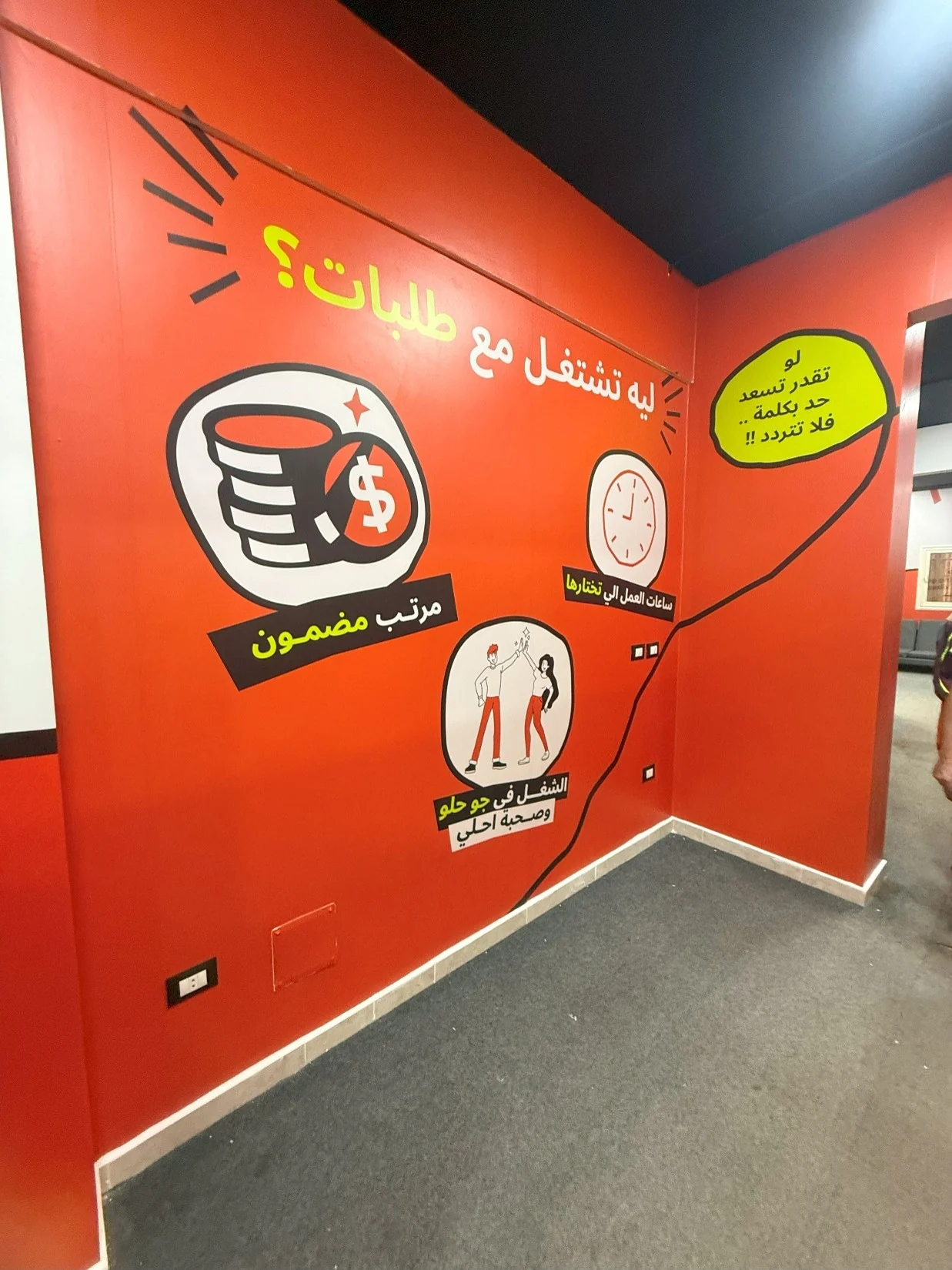
We built the space around Talabat's high-recognition orange, bold black framing, line illustrations and energetic green highlights. Arabic-first motivational messages, room labels and local visual references make the experience direct, familiar and rider-focused.
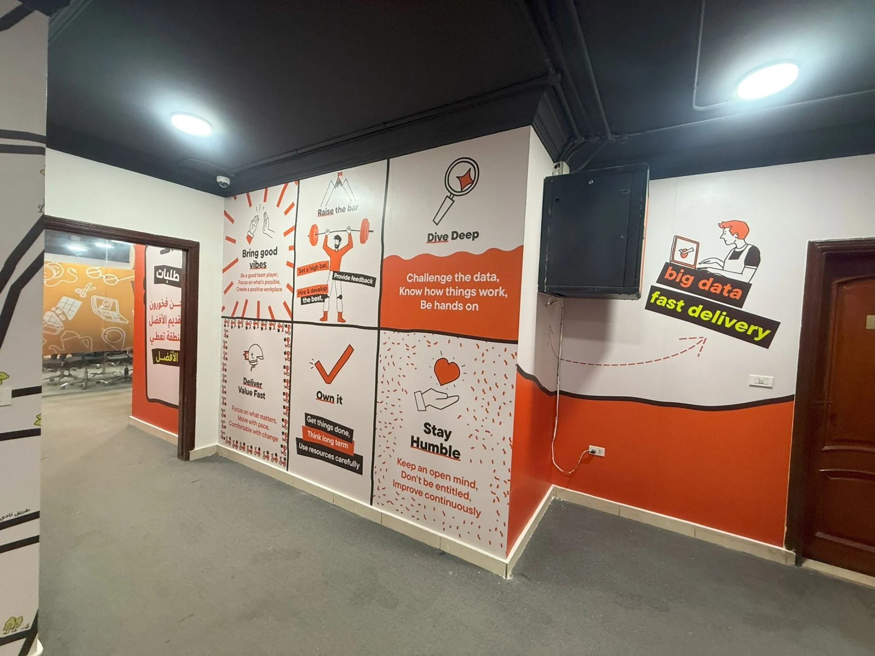
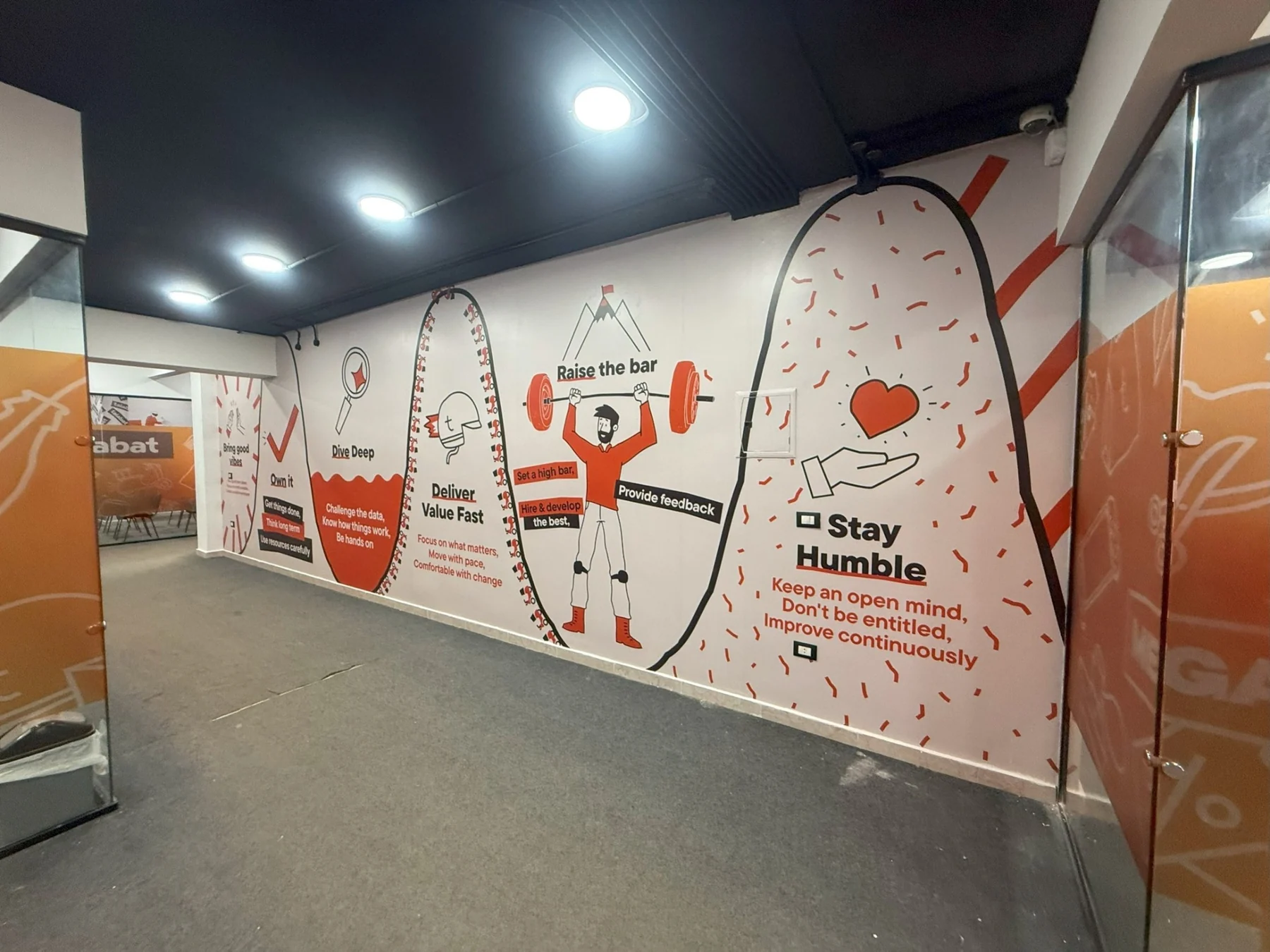
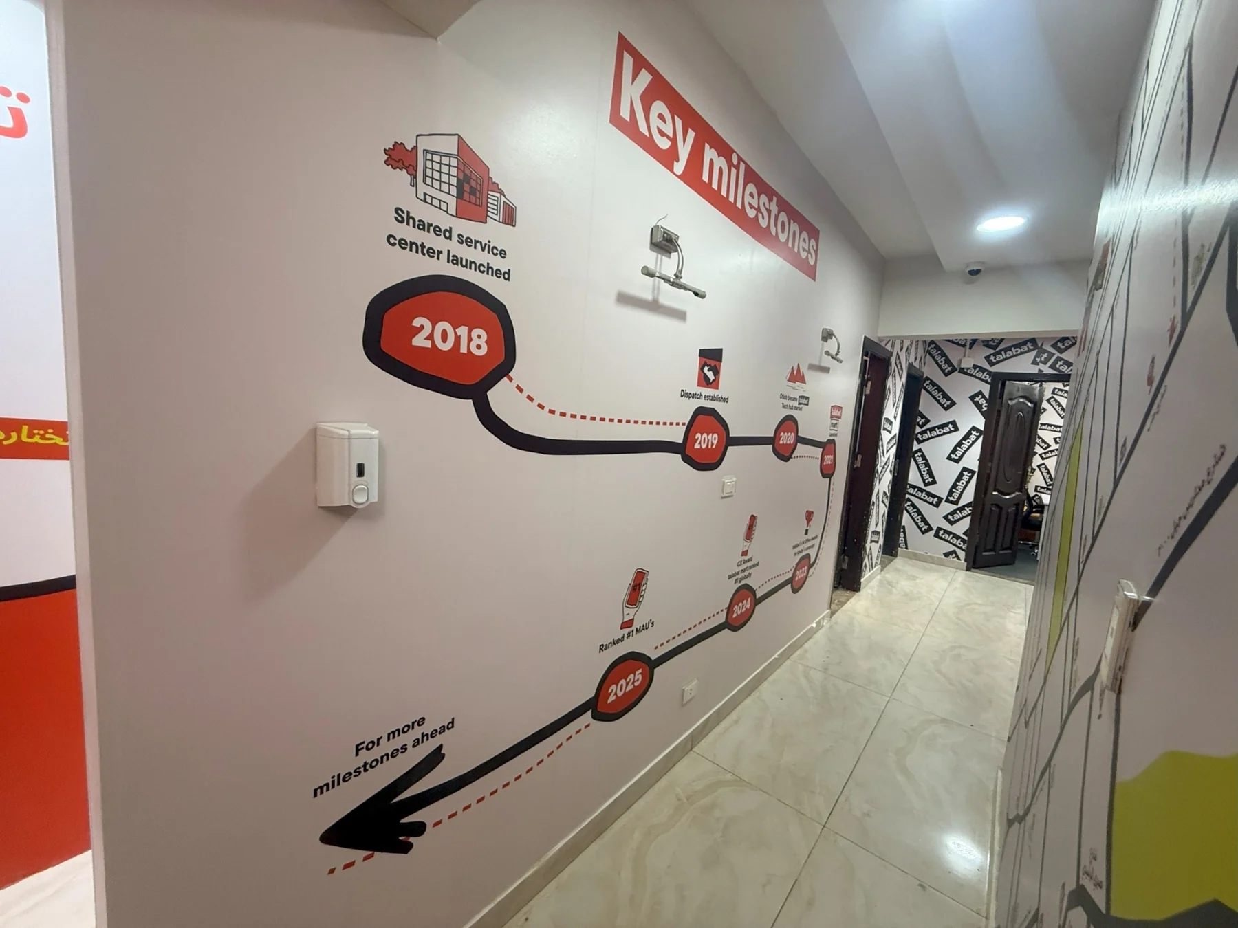
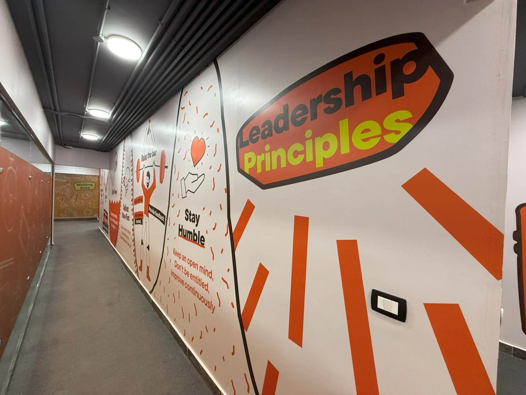
Wayfinding, office numbering, training-zone labels, a location map and a milestone timeline help the center communicate function and story. Leadership principles and service messages turn circulation spaces into culture-building touchpoints.
The experience
The final environment balances operational clarity with brand energy. Riders and teams move through spaces that feel connected, welcoming and unmistakably Talabat—from the facade and reception to training, meetings and everyday support areas.
The result is a complete Rider Center identity where environmental graphics do more than decorate: they guide, motivate, explain and reinforce belonging.